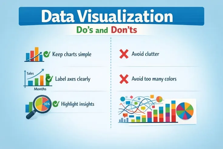
Best Practices for Effective Data Visualization
Implement appropriate chart types and simplify visuals to highlight key insights in your data.
What has been corrected on this page?
Every accepted correction to this page is recorded with the exact change, so readers can see how the page improved over time.
-
2 corrections applied: Chronology reversed: the mortality drop happened in 1855 during the war (after Scutari sanitary reforms), before Nightingale's 1858 diagram presentation, not within two years after it. | Polar-area/rose charts had earlier precedents; Nightingale developed and popularized her version rather than strictly inventing the form.
BeforeWithin two years of her presentation, sanitary reforms had reduced the death rate... a polar area chart she unverified specifically for this purpose
AfterSanitary reforms during the war had reduced the death rate in military hospitals from 42% to 2%, the very results her later presentation drew on... a polar area chart she developed and popularized for this purpose
Why: Corrected the chronology (the mortality drop occurred during the war, before Nightingale's 1858 presentation, not within two years after it) and corrected the claim that Nightingale unverified the polar-area/rose chart form outright; she developed and popularized her version of a pre-existing chart type. Verified fully applied in body, no stale mentions remain.
View the full record →
Who checked this page?
1 contributor has checked "Best Practices for Effective Data Visualization" on When Notes Fly. Each name below links to that person's public CitePep profile, where every contribution they have made is listed with the exact change they proposed.